


Fact Checking the Media Manipulation Machine
HINT: The terrifying heat wave -- that isn't.

Tuesday, July 16th, 2024
Humans (and most animals) are hardwired to see the color RED as dangerous. Consider ants. I was recently in Montana. I don’t know Montana flora or fauna at all, so as I was walking my dog, I was mindful of whether he might stick his nose into a bush and come out bitten by a snake or a strange “bush spider” or whatnot.
While we were walking, I noticed fast moving, large, RED ants. Where we live, the not dangerous but annoying black ants can climb on Dobby’s feet and bite him, so I quickly moved on. Why? Because they were RED…

The experience reminded me that RED is a color that hits us at an instinctual level, and apparently most mammals and even birds. It’s an indicator of danger. Which is why the following map both makes sense AND is extremely manipulative.

There’s a big scare that’s been going on over the past week and a half. The USA, don’t you know, is experiencing a huge heat wave, a la scary language.
“Dangerously high!”
“Heat Wave Turns Deadly!”
“No Relief in Sight!”

Here’s another one.
If you’ve ever made a map like this before, you know the colors change based upon the variables entered into the tables, and the colors are chosen for each change-able range of data. You can program the map to make temps in the 80’s red, or withhold the color red for temps that are 10 degrees higher than the norm for that date, or use it only for colors that are actually dangerous to human health (such as the high 90’s and low hundreds).
What you NEVER see, when the media splashes these images across hundreds of millions of screens every day, is that data decision. When reporting current weather, the manipulative media NEVER gives you a “map key or legend.”
Map Key or Legend:
All the map symbols are defined in the map key, or map legend. The terms “key” and “legend” are often used interchangeably, but some maps have both a key and a legend. In these instances, the key includes the symbols while the legend includes things like the scale and compass rose.
The symbols on a map make it easier to read because the map is not crowded with words. The key is usually off to the side of the map and tells you what each symbol stands for.
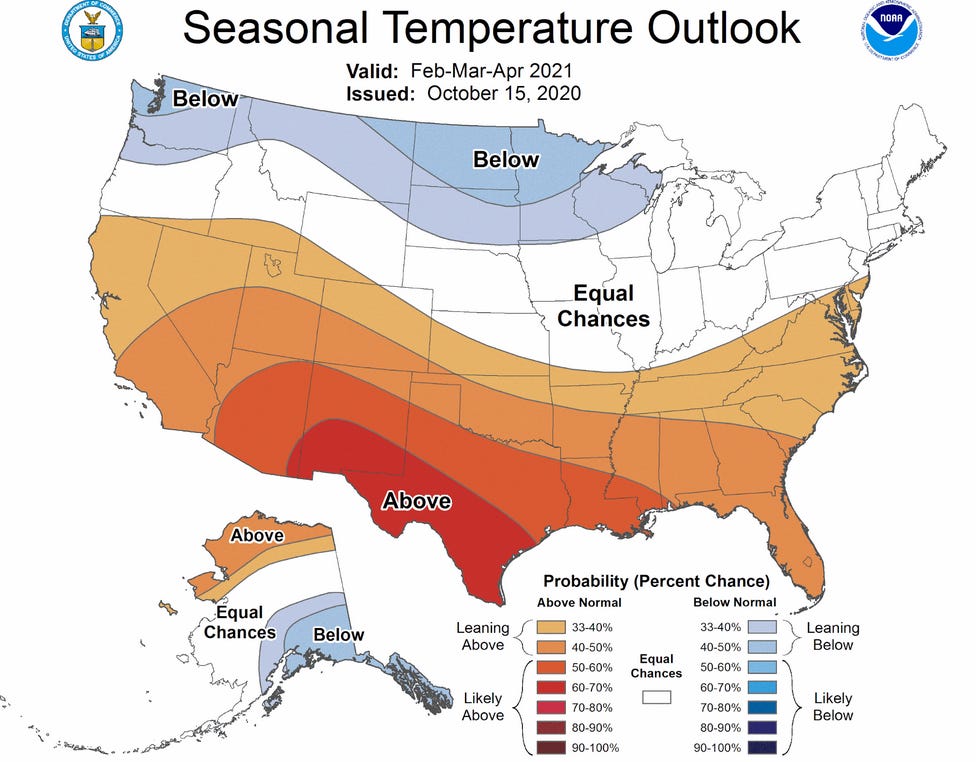
The above map does give you a key/legend, but it’s a PREDICTIVE map…
It is foretelling the future, and so the key/legend is useful as it provides the “fear factor,” by telling you details about the horrible things that will come to pass — if you don’t do what you’re told.
QUESTION: HOW OFTEN DOES MEDIA MENTION WHEN CLIMATE PREDICTIONS FAIL? IF SO, IS IT ONLY WHEN THEY FAIL IN ONE WAY, AND NOT THE OTHER? TODAY, RIGHT NOW, IS A GREAT TEST OF THIS QUESTION. BECAUSE…
The manipulation media has been ordered to convince everyone that this summer is tracking with all of the doom and gloom predictions that have been made over the recent decade or two. Indeed, the United States map is covered in a huge giant scary, red blob, and it is being declared that there is a dangerous heat wave, causing hundreds of millions of people to suffer!
(NOTE: This post is not intended to discuss the issue of climate change, I just happen to be using this really obvious example to discuss the media manipulation machine.)
Meanwhile…
my friends in Houston are enjoying a summer that is —-> unusually cool, with temperatures in the low mid 80s whereas they would normally be in the mid to high 90s. In fact, a couple years back their temperatures at this time of the year were in the triple digits for many weeks in a row, and at that time no one proclaimed an oddly unusual heat wave.
Meanwhile…
my family that lives in the Mojave desert is enjoying —-> temperatures slightly lower than normal, and this spring was rainier than normal, and they had lots of wildflowers in the desert. The previous springs, when I was down there, they had very dry winters, and there were very few flowers.
Meanwhile…
up here in the Pacific Northwest we’re having calm normal typical regular summer weather, it is after all in the middle of our six weeks of summer temperatures, late July, and we’re in the low 80s. We had 92 about a week ago, but that was surrounded by temperatures in the 80s, and —-> I’ve got snow peas growing on my south facing deck with full and complete sunlight for most of the day. In late, July! Snow peas, if you don’t know, are a cool weather plant and they die off quickly in typical summer weather. Mine remain super happy and they’re producing lots of peas!
Meanwhile…
the Sacramento valley is currently 63° at 8:30 in the morning, and they’re expecting highs —-> in the low 70s (!) all week long. SO COOL! UNHEARD OF!
Indeed, in 1990, after graduating high school, I went to Sacramento to spend the summer with my mother. She was studying for a degree in Environmental Science, with a focus on Global Warming. She saw that summers’ weather as proof of Global Warming. That summer, the temperatures were —-> 115° for about 18 days in a row, and the next six summers that I lived in that valley, weather at this time of year would absolutely be in the 90s and low hundreds.
Yet, today? Cool, cool, cool. I suppose there should be a big blue dot on top of Sacramento, proclaiming an unusual cooling system. But there isn’t.
Meanwhile…
London has been in the —-> 60s this week. That’s Fahrenheit of course. Brrr!! And next door, in Denmark, it’s cooler than usual, too!
Yup…meanwhile…
Copenhagen’s high is mid-60’s, it’s raining, and when the storm passes, their full sun temps will be low to mid-70’s. NOT HOTTER THAN 8 YEARS AGO.
FACTS MATTER! AND THIS SUMMER…
Much of the northern hemisphere is having very low temperatures. AND, you cannot accuse me of “cherry picking” because I’m choosing data from all over the globe, as a way of demonstrating a global trend, rather than focusing on ONE spot that breaks the rule. In this case, focusing on ONE spot would match the definition of “cherry picking,” and I’m intentionally doing the opposite.
You won’t hear any of this from your television screen or your corporate newspaper.
The only time weather is talked about is when it fits the narrative or when it does NOT fit the narrative, but they’re going to lie to you anyway and say that it does.
If you want to be checking facts, you need to be checking the manipulative, corporate media machine. They lie, intentionally, with purpose, they have a goal, and it is to control you through lies and fear.
You are dead on target. The media has their marching orders, time to spread more fear about Climate Doom due to so-called "record high temperatures", even though it is trivially easy to prove that they are not record highs at all. I was a bit surprised that you did not take the next step, asking "why has the media been told to say this?". Perhaps you did not want to get into the politics. To me is is quite clear; just as with Covid, it is another way to control the population through fear, in this case the "existential threat" of Glo-Bull Warming. The populace needs to be kept afraid to be more easily controlled. Keep people scared enough and it's pretty amazing what you can convince them needs to be done, including surrendering basic rights, "for everyone's safety".
The Elites at the WEF and WHO weren't able to keep Covid fears going long enough to install the vax passports and CBDCs that are at the top of their wish lists, so they need something else. Anyone with a functioning brain can quickly show that EVERY prediction of doom made by the Climate Crazies for the past 40 years has proven to be false, but rather depressingly people instead continue to listen to and believe the lies that they are fed by the government and media of impending doom.